PARALLEL ARCHIVE (PAAR) IS A SPATIAL DESIGN STUDIO BASED IN SEOUL. WE INTERPRET AND SUGGEST THE VALUE OF THE USE AND SHAPE OF OBJECTS WITH DIFFERENT TIME AND STORIES IN A NEW CONTEXT. WE TRY TO SHED LIGHT ON THE UNKNOWN VALUE OF A SPACE WITH A DELICATE SENSE, AND AIM FOR AN UNPREDICTABLE VARIETY OF PERSPECTIVES AND THOUGHTS THROUGH INTERACTIVE COMMUNICATION.
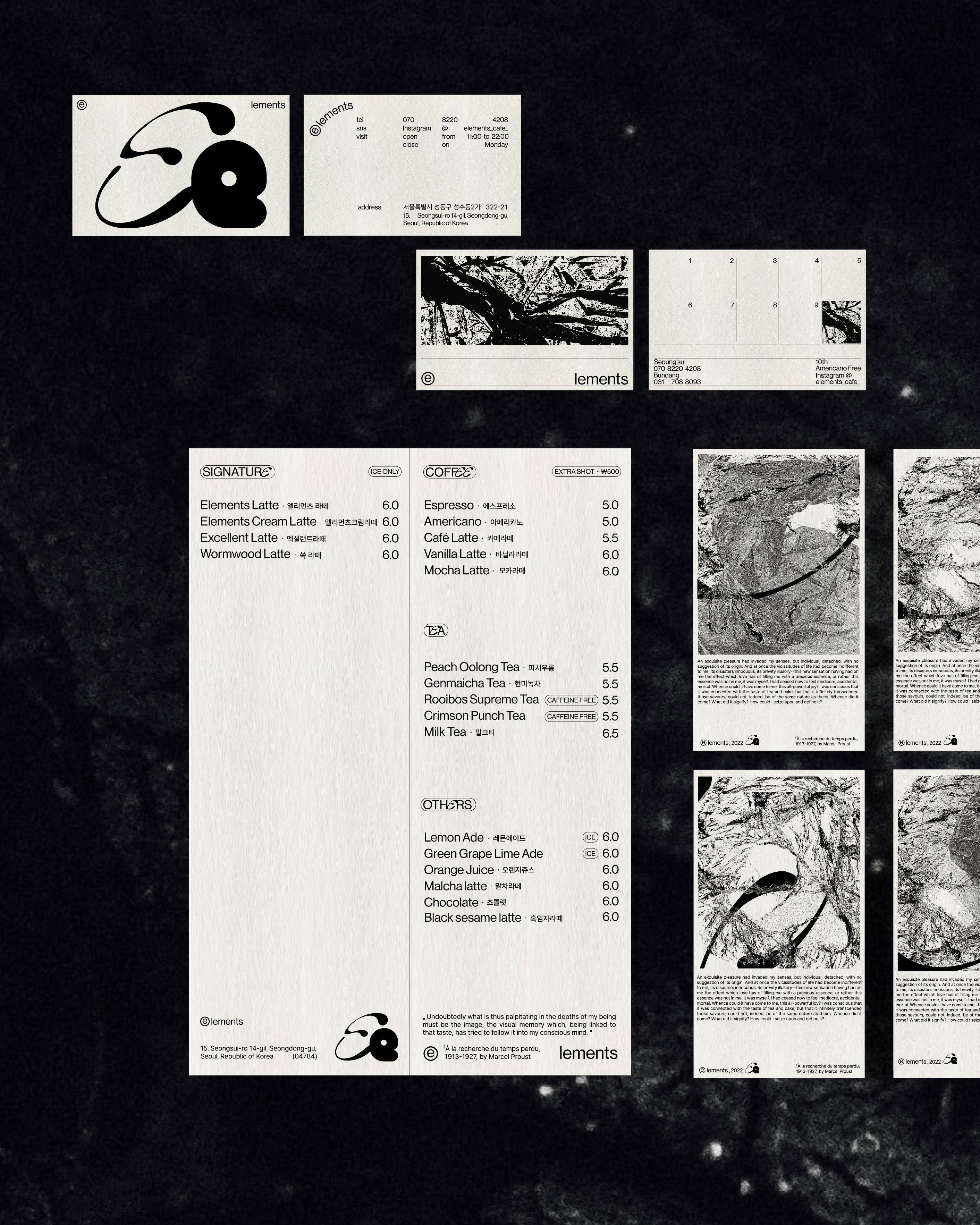
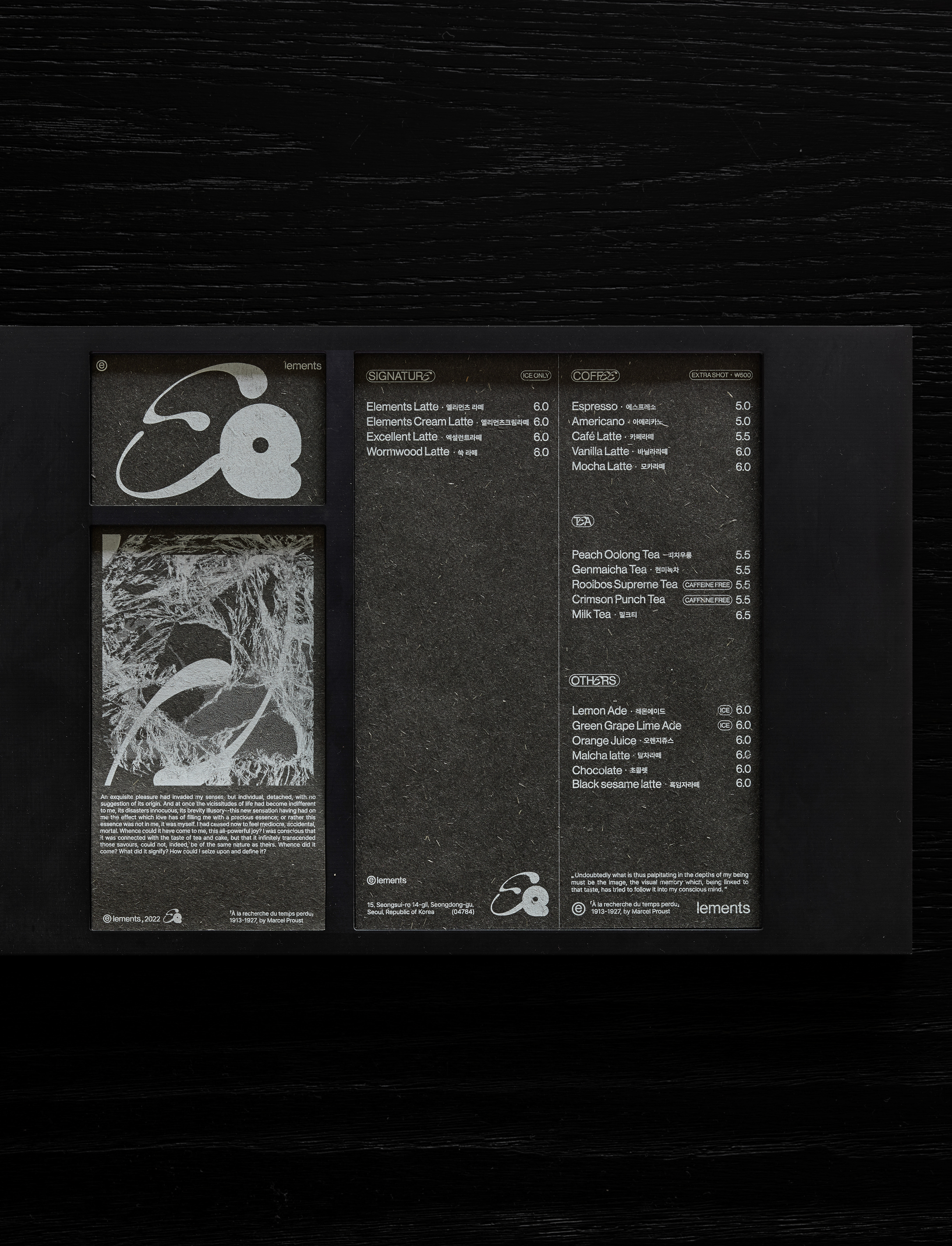
Elements 엘리먼츠
+ Client: @elements_cafe_
+ Location: Sungsu, Seoul, Korea
+ Category: Visual Identity
+ Typology: Food & Beverage, Branding
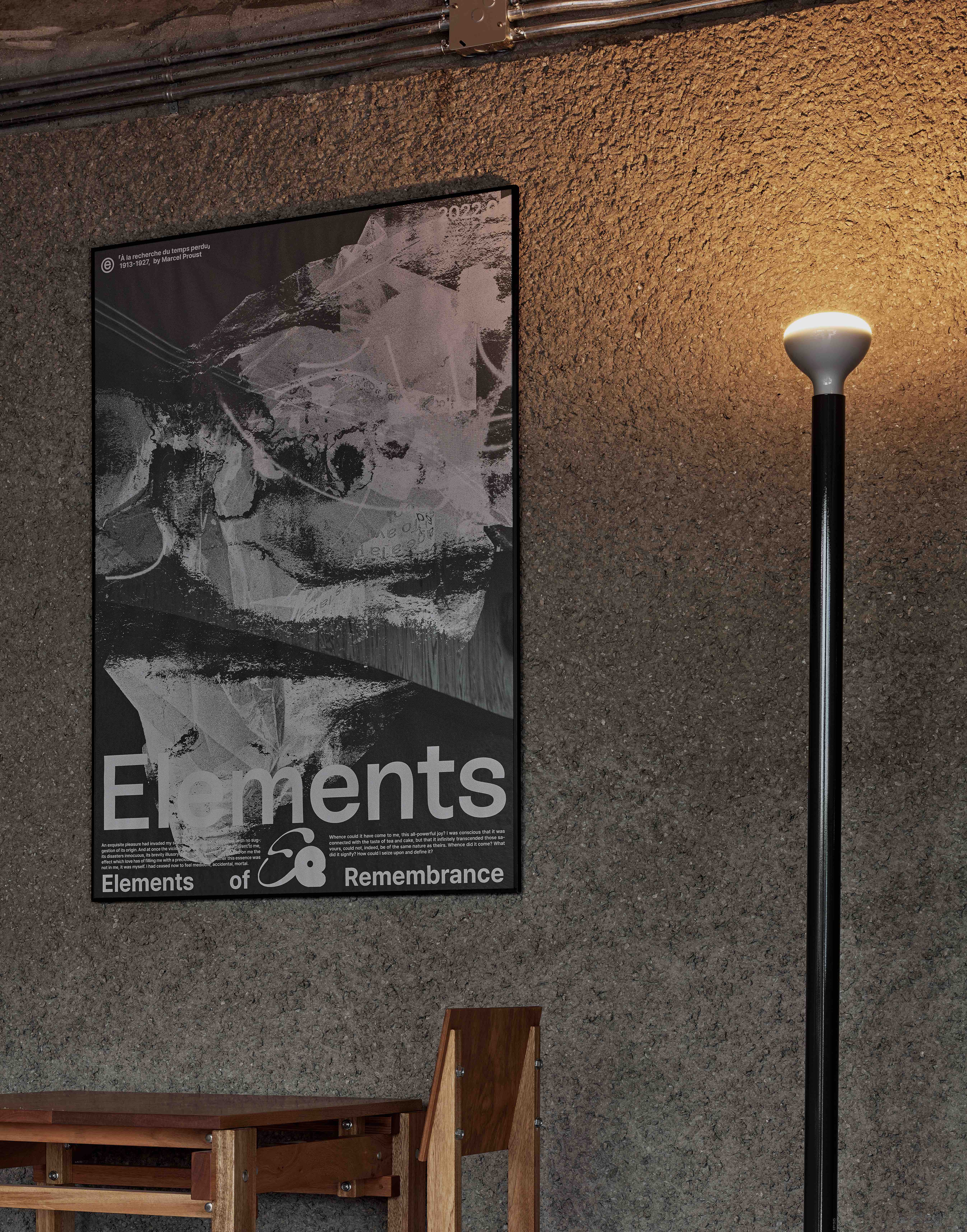
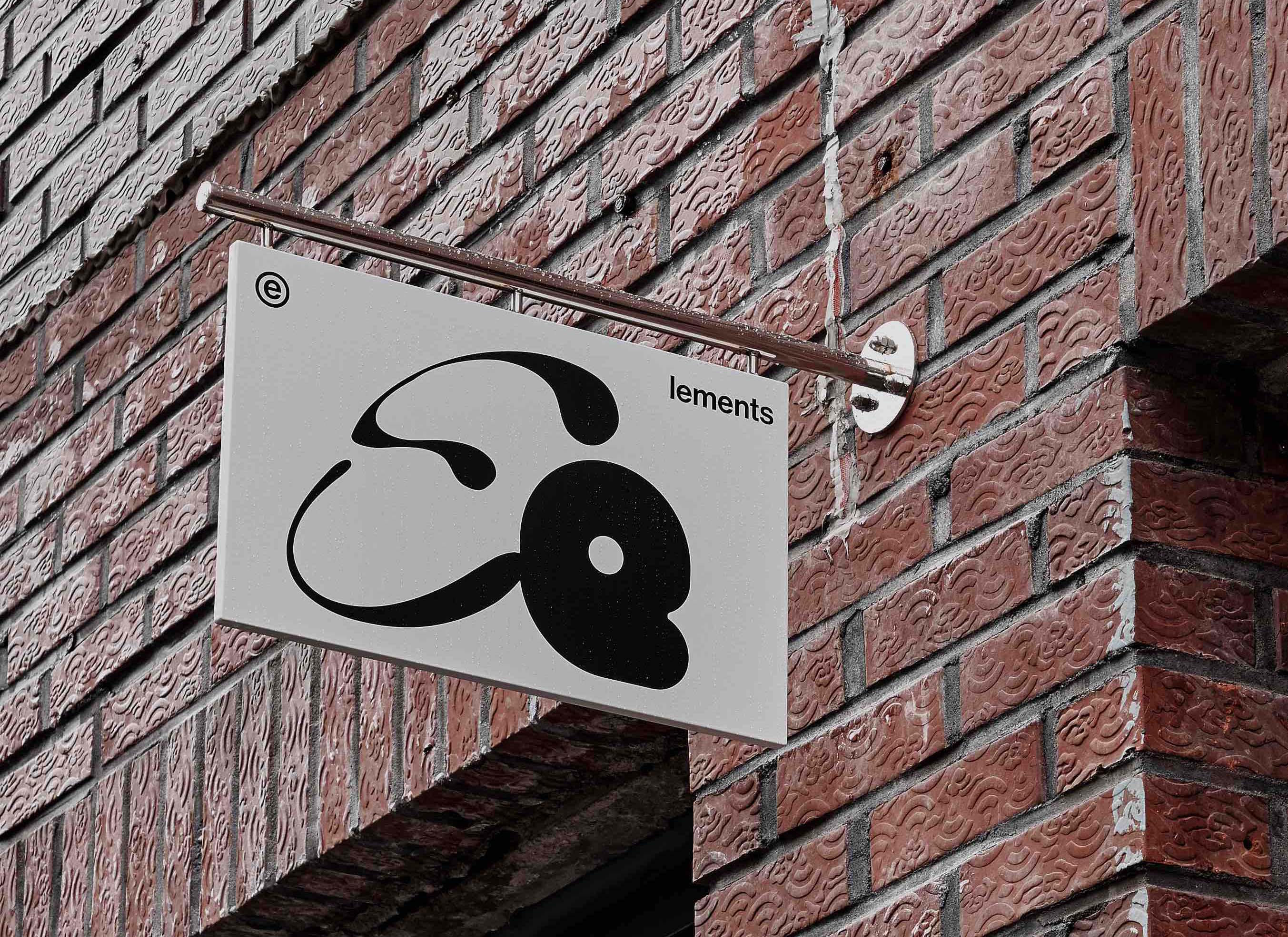
엘리먼츠 카페의 비쥬얼 아이덴티티는 공감각적 심상을 불러 일으켰던 프루스트의 마들렌 한조각에서 출발했다. 마들렌 한입으로 콩브레의 전경이 현실 속에서 생생하게 재현되었듯, 미각과 후각을 포함한 특정한 감각이 사람마다 제각기 다른 형태와 인상을 담은 강렬한 시각적 경험으로 전이되는 찰나의 환희를 엘리먼츠 카페가 지닌 주요한 의미이자 핵심 (ELEMENTS) 이라고 보았다.
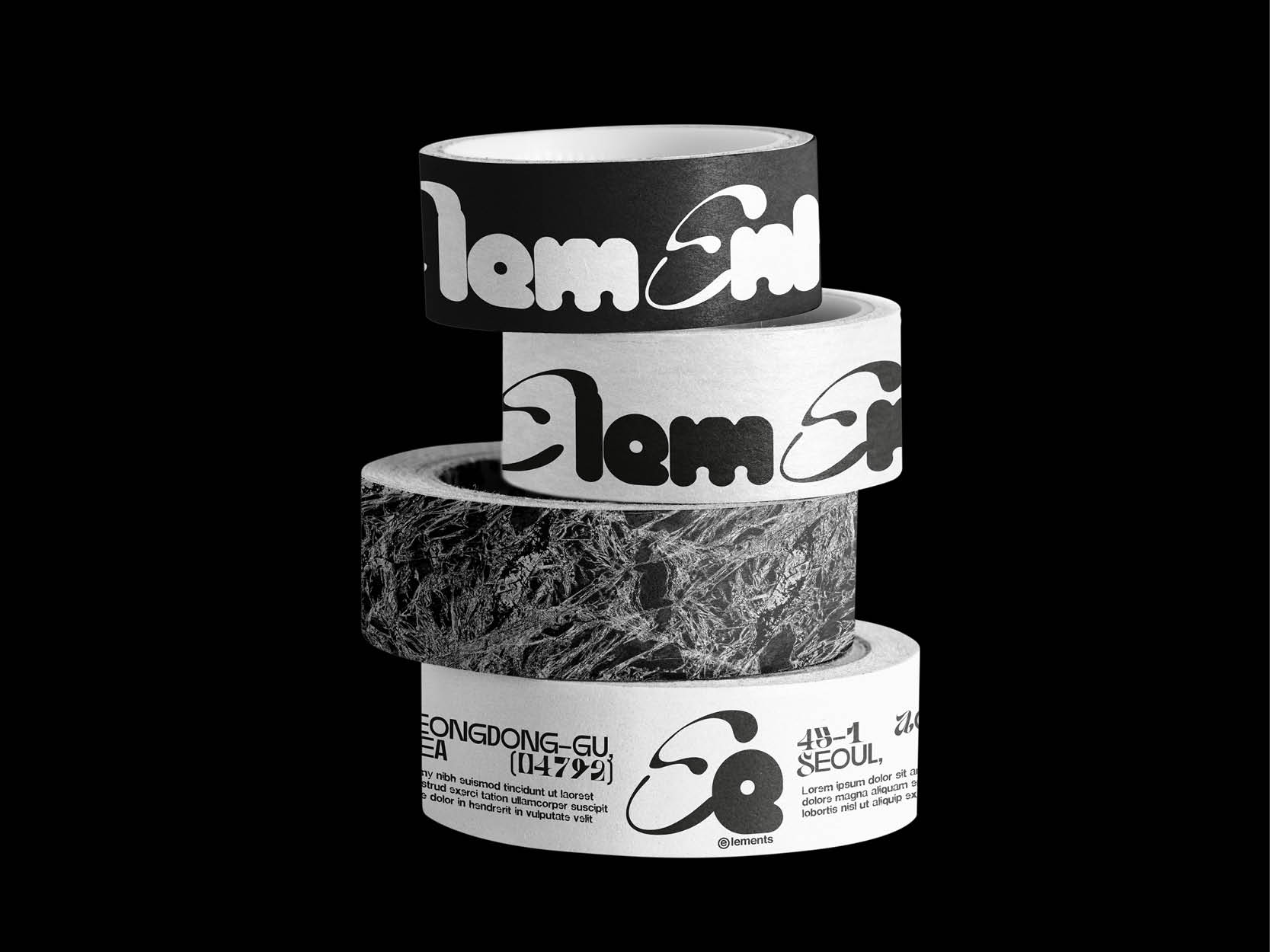
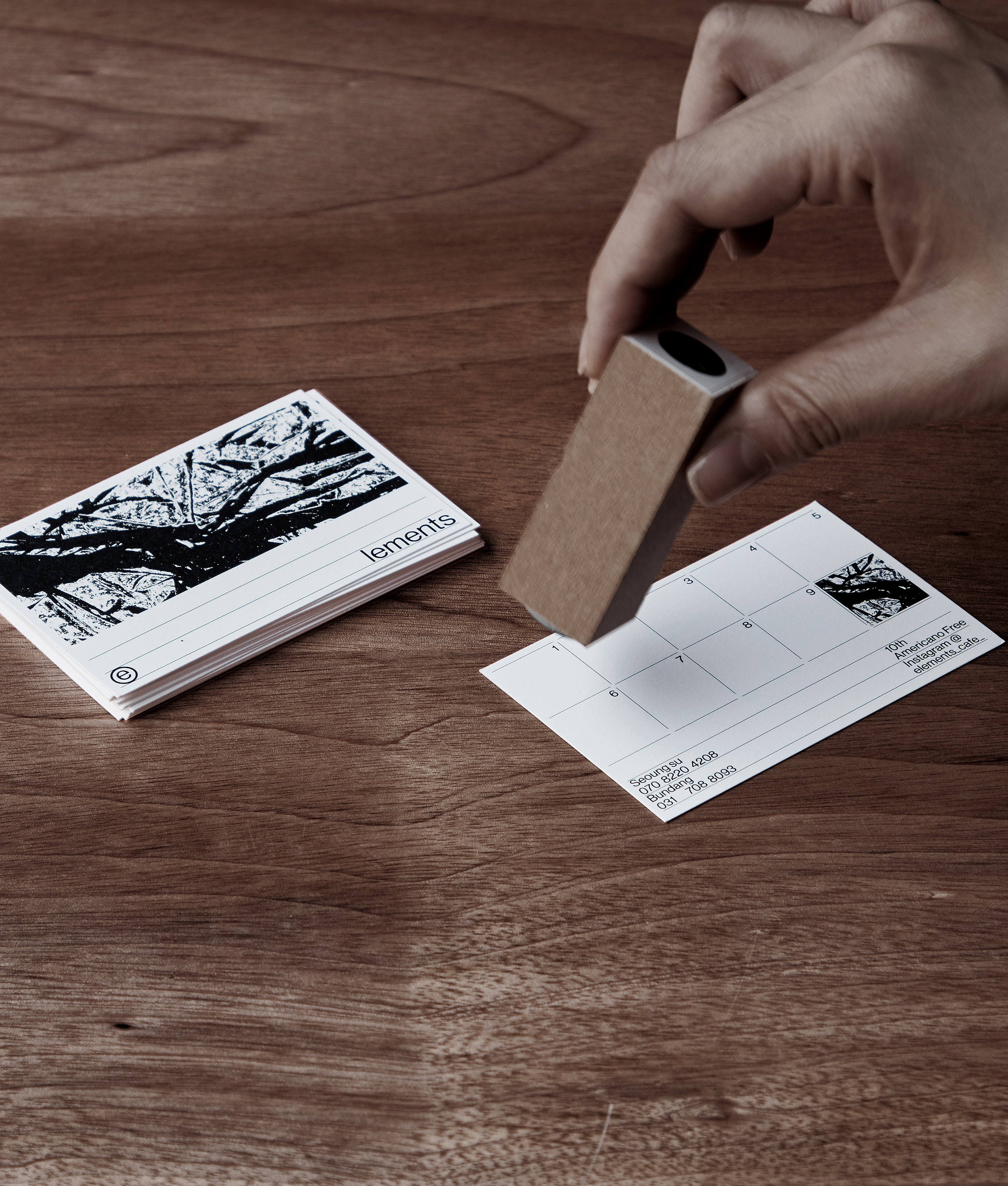
포스터와 리플렛에 사용된 메인 이미지는 엘리먼츠가 자리하게 될 공간의 거친 텍스쳐감을 접목시켜 제작되었고, 이미지와는 상반된 느낌의 모던하고 유려한 형태를 지닌 로고는 전이의 순간을 표현하는 이미지에 리듬감과 역동성을 강조하기 위한 조형미에 치중하여 디자인되었다.
The visual identity of Cafe Elements started with a piece of madeleine from Proust, which caused synesthesia. Just as a bite of madeleine reproduced the view of the Combray in reality so vividly, the instant joy of certain senses, including taste and smell, being transferred to an intense visual experience that contains different shapes and impressions for each person was considered the key ELEMENT of Cafe Elements.
The main image used in the poster and leaflet was produced in view of rough texture of the space where the elements will be located, and the logo, which has a modern and elegant shape contrary to the image, was designed to emphasize rhythm and dynamics in the image that expresses the moment of transition.