PARALLEL ARCHIVE (PAAR) IS A SPATIAL DESIGN STUDIO BASED IN SEOUL. WE INTERPRET AND SUGGEST THE VALUE OF THE USE AND SHAPE OF OBJECTS WITH DIFFERENT TIME AND STORIES IN A NEW CONTEXT. WE TRY TO SHED LIGHT ON THE UNKNOWN VALUE OF A SPACE WITH A DELICATE SENSE, AND AIM FOR AN UNPREDICTABLE VARIETY OF PERSPECTIVES AND THOUGHTS THROUGH INTERACTIVE COMMUNICATION.
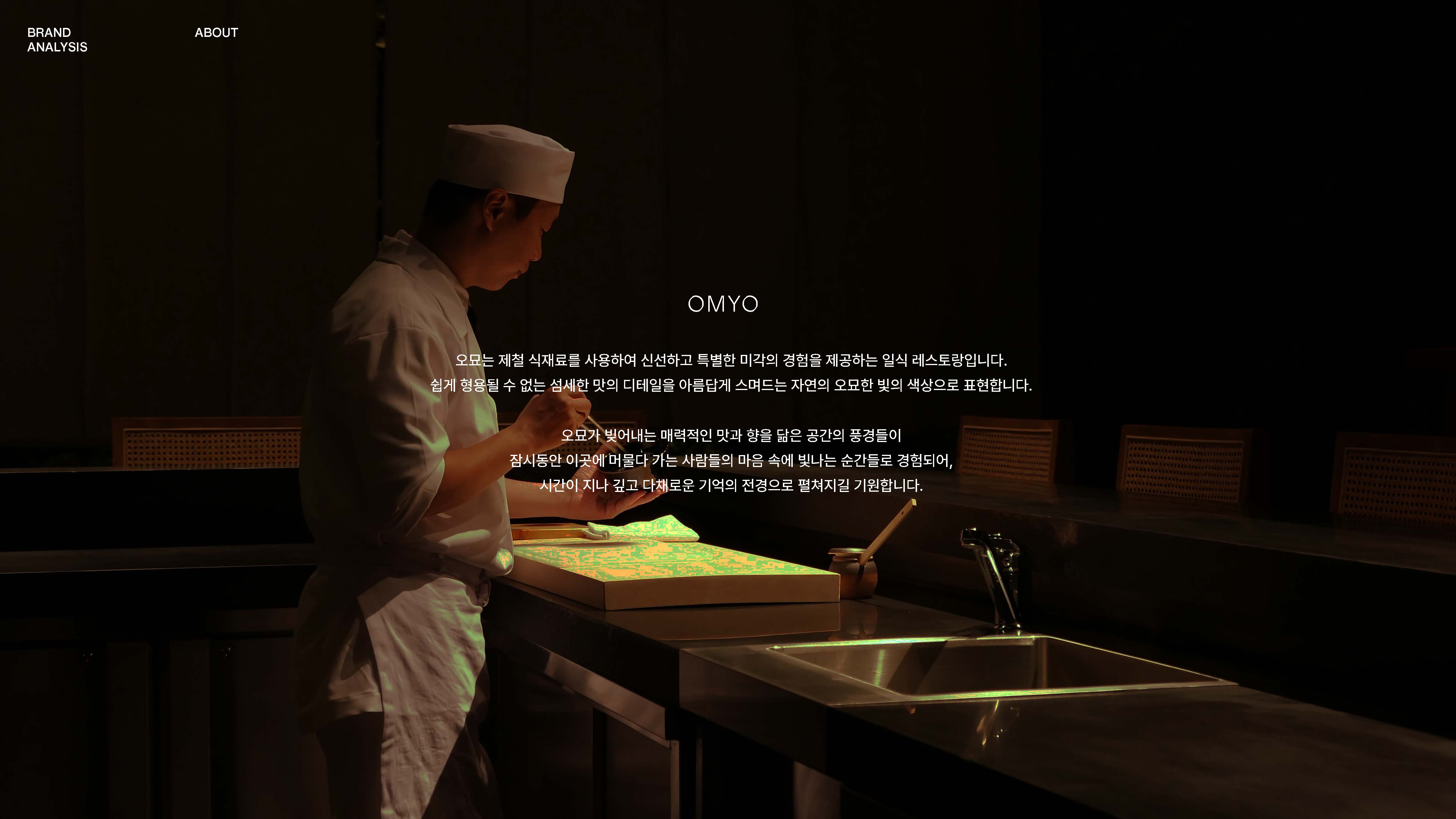
OMYO 오묘
+ Client: Individual
+ Location: Youido, Seoul, Korea
+ Category: Visual Identity
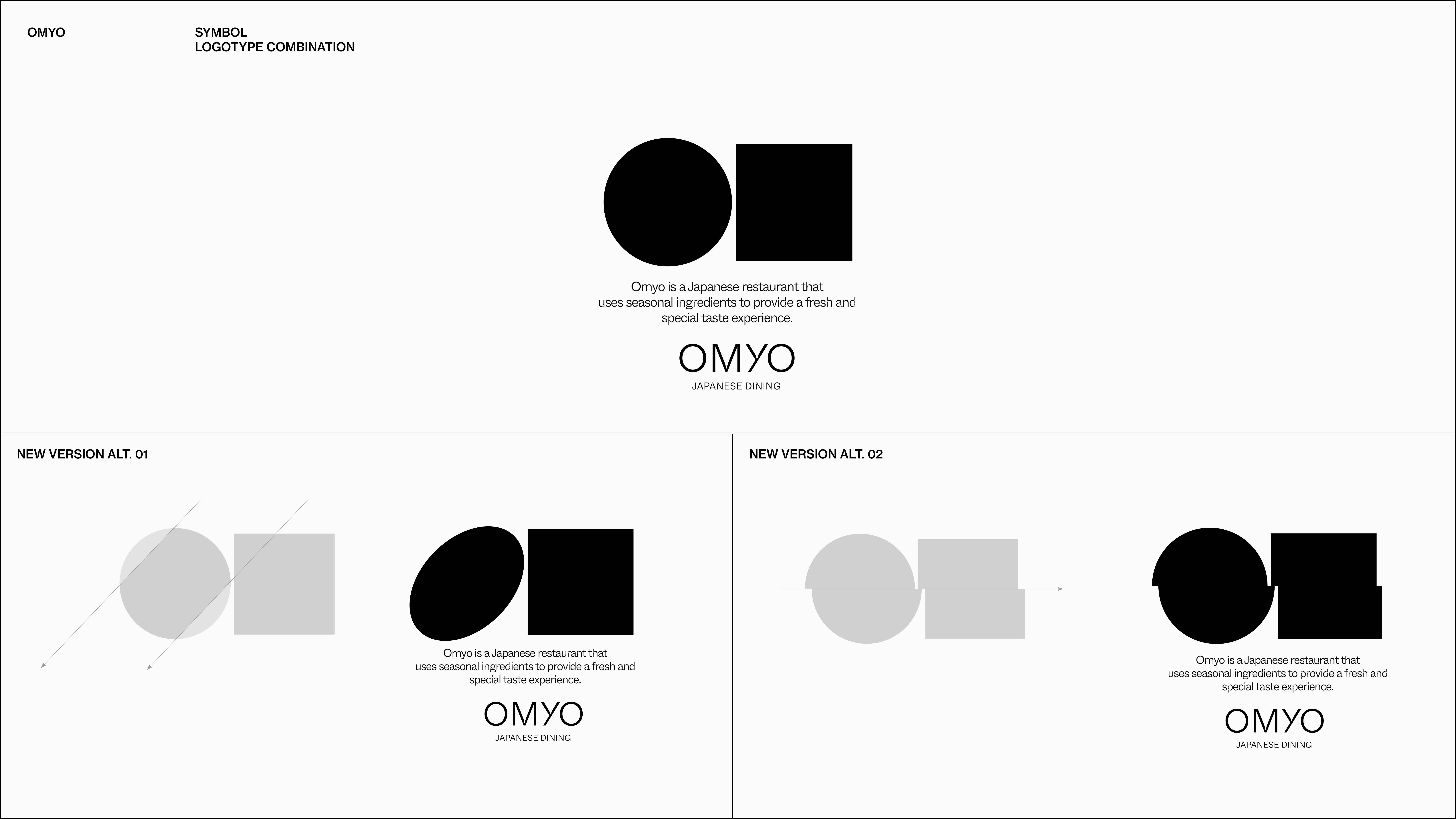
+ Typology: Japanese Dining, Branding
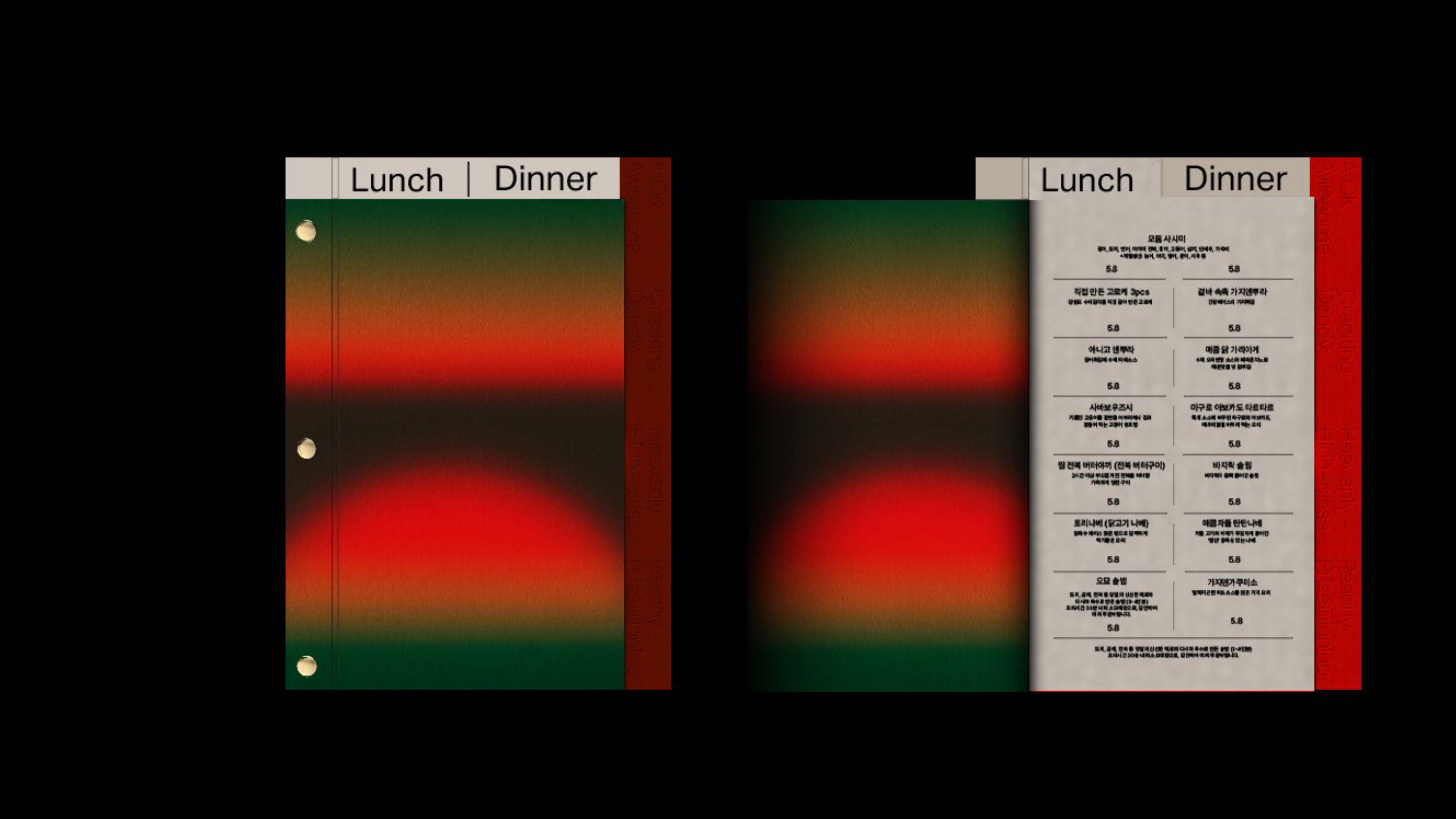
일식 레스토랑 오묘의 브랜딩은 단어 자체가 자아내는 심미적인 분위기를 시각적으로 재현해 내는 것에 집중했다. 특정한 형태나 조형 디자인을 최대한 배제하고 사람들의 기억 속에 강한 잔상을 남길 수 있는 컬러 그라데이션을 사용해 오묘함을 극대화 하고자 했으며, 오묘가 추구하는 미묘한 맛의 디테일과 연결시켜 미각의 경험을 시각적으로 확장시키는 것이 중요한 과제였다.
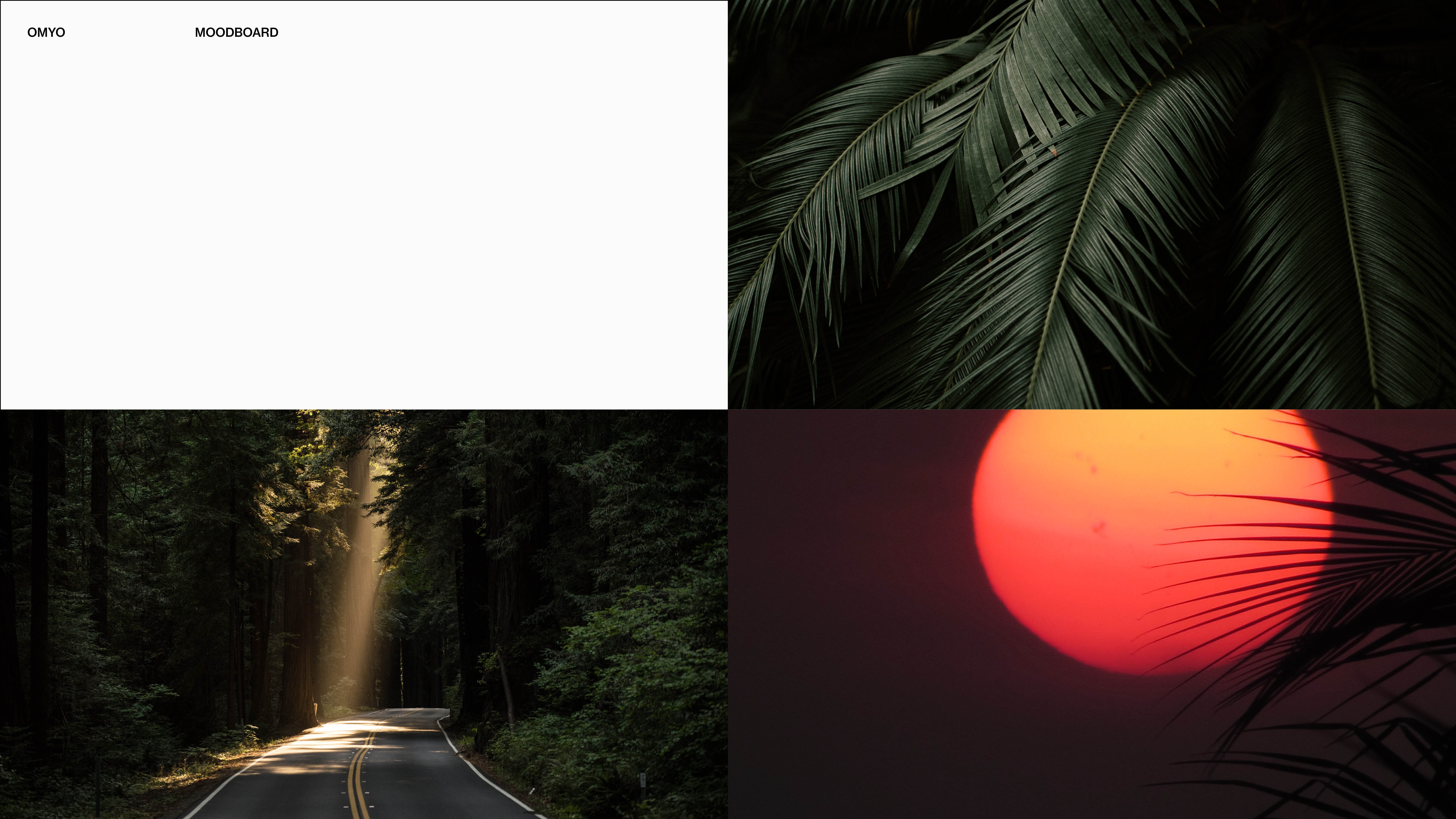
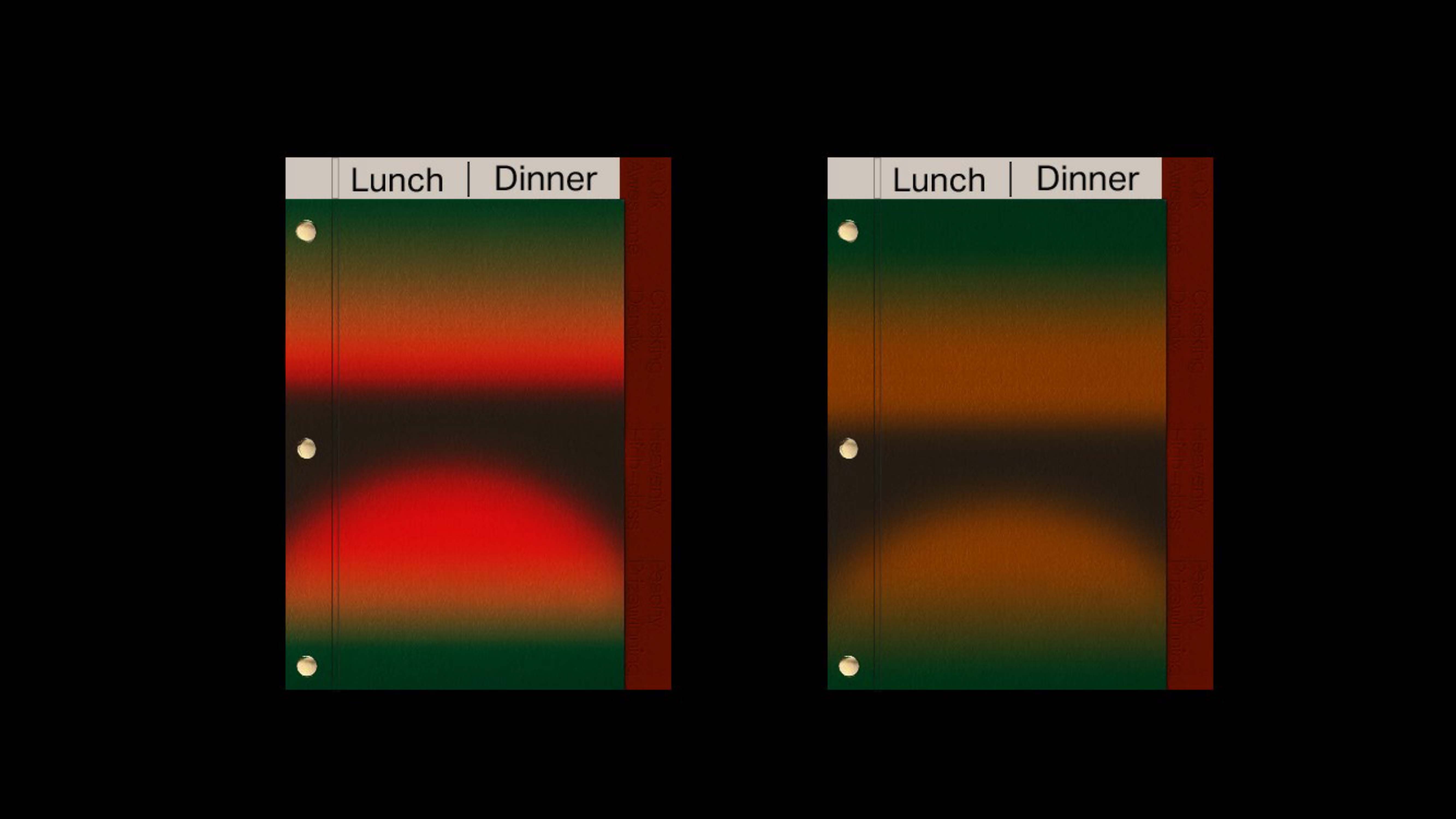
오묘의 비쥬얼 아이덴티티에 핵심적인 역할을 하는 메인 컬러는 짙은 그린과 비비드한 레드색상의 조합이다. 이는 오묘가 표방하는 세가지 키워드 (PROFOUND 깊고 심오한/ DELECATE 섬세한 사려깊은/ REFINED 정제된)를 담기 위해 설정한 상징적인 풍경, ‘잔잔하고도 강렬한 노을 빛이 스며드는 깊은 숲속’을 환기시키기 위한 것으로 미각의 확장된 경험이라는 브랜드의 핵심과제를 관통한다.
The branding of Japanese dining, OMYO focused on visually recreating the aesthetic atmosphere that the word itself evokes. We tried to maximize the subtlety by excluding certain shapes and formative designs as much as possible and using color gradations that can leave a strong afterimage in people's memories. It was an important task to visually expand the experience of taste by connecting this with the subtle taste details pursued by OMYO.
The main color, which plays a key role in OMYO's visual identity, is a combination of dark green and vivid red. This is to remind you of the symbolic landscape, "Deep forest where subtle but intense sunset light permeates," which is came up with to contain three keywords (PROFOUND/ DELECATE/ REFINED)that OMYO pursues, and it also penetrates the brand's core task of expanding taste.