PARALLEL ARCHIVE (PAAR) IS A SPATIAL DESIGN STUDIO BASED IN SEOUL. WE INTERPRET AND SUGGEST THE VALUE OF THE USE AND SHAPE OF OBJECTS WITH DIFFERENT TIME AND STORIES IN A NEW CONTEXT. WE TRY TO SHED LIGHT ON THE UNKNOWN VALUE OF A SPACE WITH A DELICATE SENSE, AND AIM FOR AN UNPREDICTABLE VARIETY OF PERSPECTIVES AND THOUGHTS THROUGH INTERACTIVE COMMUNICATION.

PLEM
JJ house
Asan Hospital
Sihodo Studio

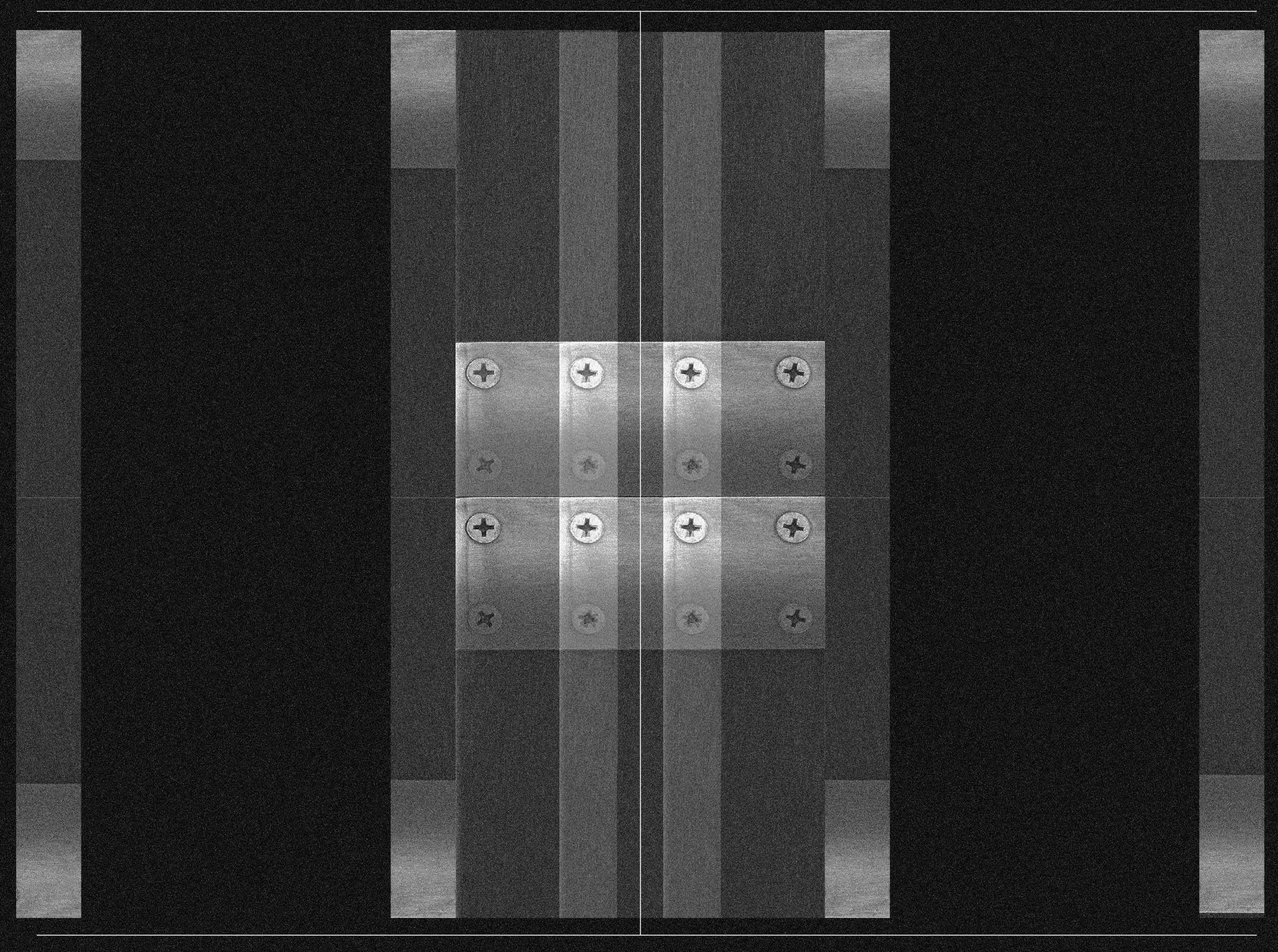
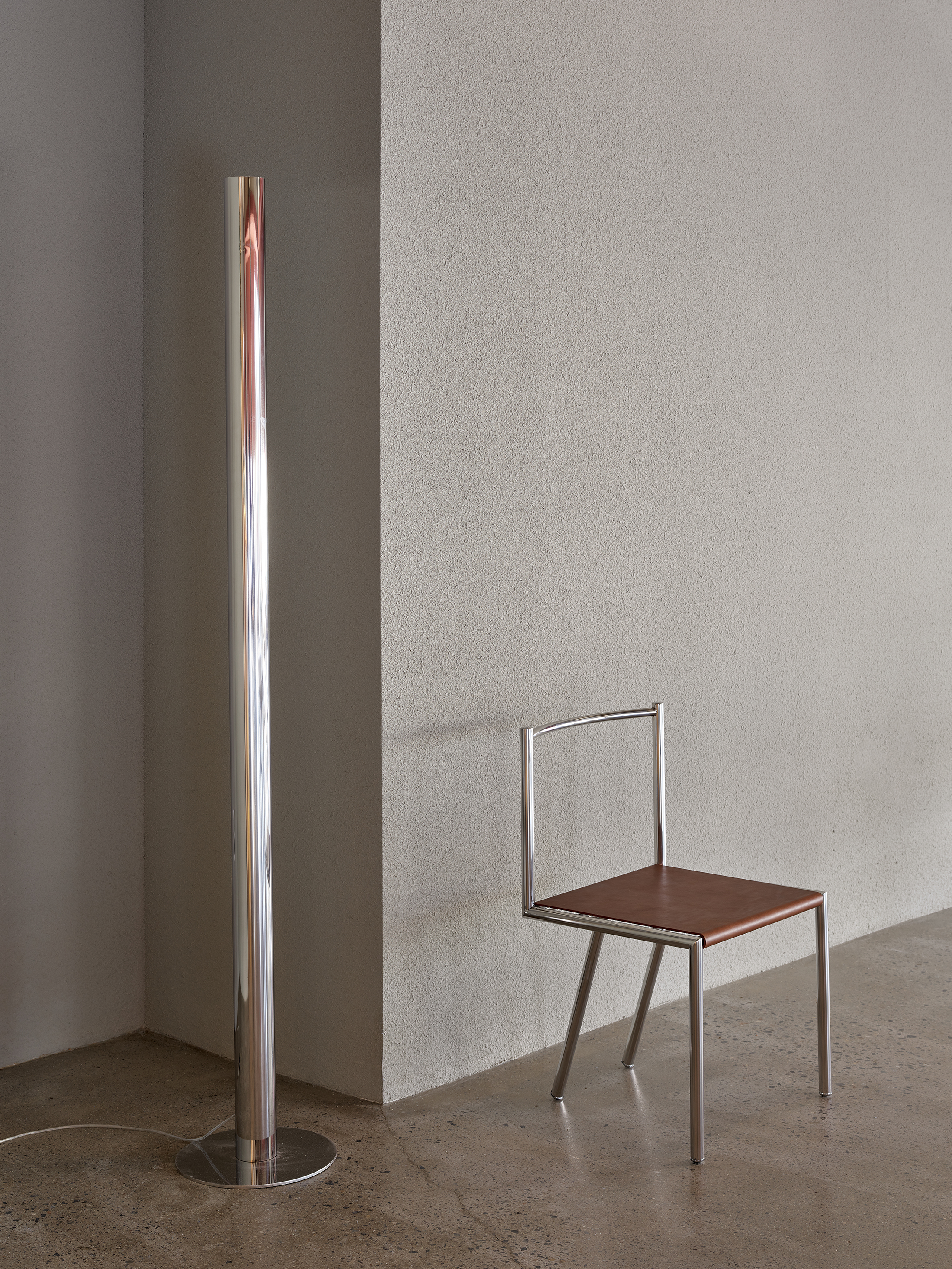
Modular Shelves
Production: paar & monstructure
Location: Songpa, Seoul
Category: Interior Design
Usage: Furniture
Location: Songpa, Seoul
Category: Interior Design
Usage: Furniture
Sanho manshion
Client: @sanhomanshion
Location: Euljiro, Seoul
Category: Interior Design
Usage: Studio
Photo: @keemdg
Floor area: 142 m
Location: Euljiro, Seoul
Category: Interior Design
Usage: Studio
Photo: @keemdg
Floor area: 142 m

Hotel Aufglet
Client: @aufglet
Location: Seongsu-dong, Seoul
Category: Interior Design
Usage: Cafe
Photo: @beezystudio
Floor area: 151 m2
Location: Seongsu-dong, Seoul
Category: Interior Design
Usage: Cafe
Photo: @beezystudio
Floor area: 151 m2
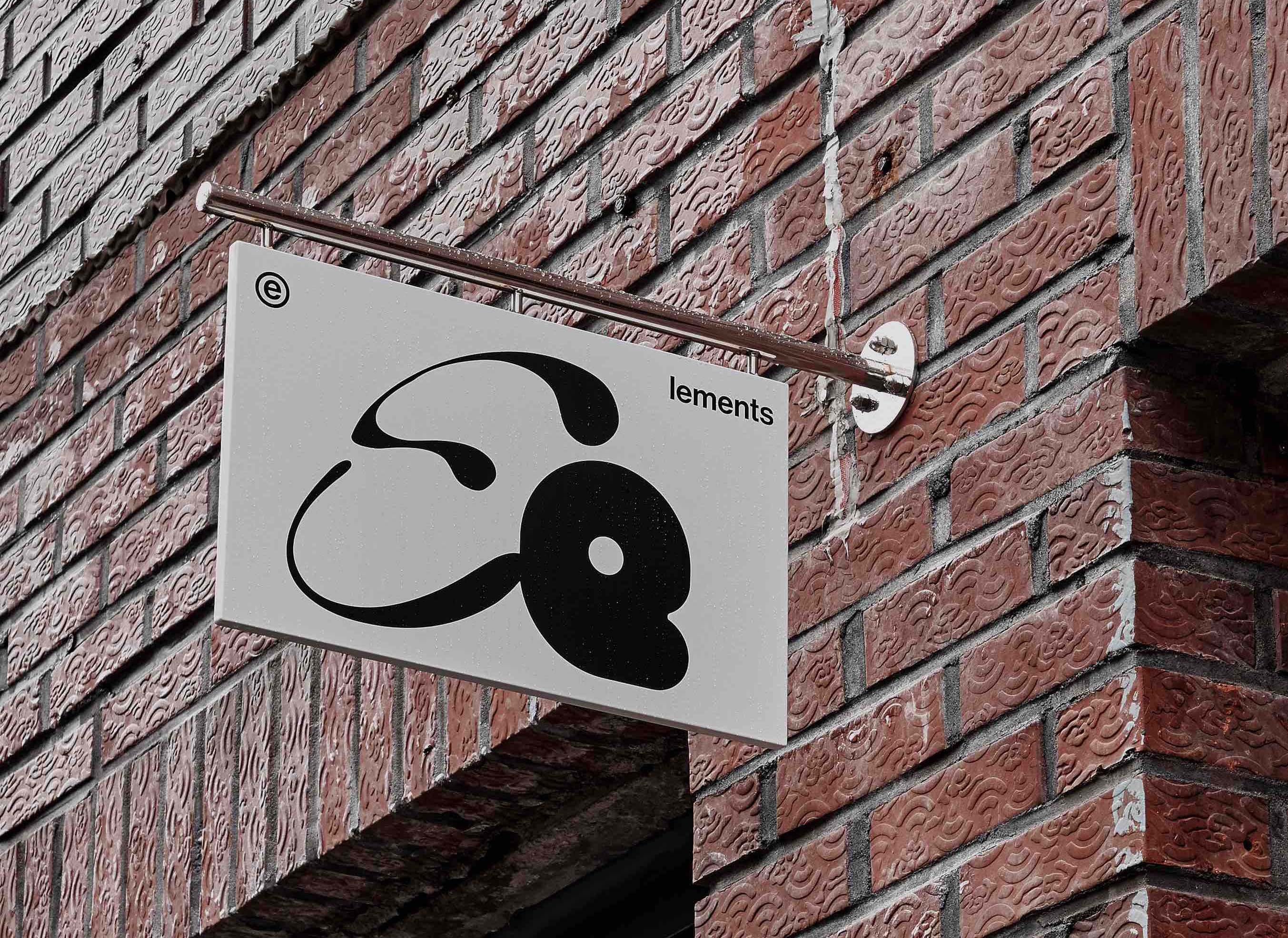
Elements 엘레먼츠
엘리먼츠 카페의 비쥬얼 아이덴티티는 공감각적 심상을 불러 일으켰던 프루스트의 마들렌 한조각에서 출발했다. 마들렌 한입으로 콩브레의 전경이 현실 속에서 생생하게 재현되었듯, 미각과 후각을 포함한 특정한 감각이 사람마다 제각기 다른 형태와 인상을 담은 강렬한 시각적 경험으로 전이되는 찰나의 환희를 엘리먼츠 카페가 지닌 주요한 의미이자 핵심 (ELEMENTS) 이라고 보았다.
Client: @elements_cafe_
Location: Sungsu, Seoul, Korea
Category: Visual Identity
Typology: Food & Beverage, Branding
The visual identity of Cafe Elements started with a piece of madeleine from Proust, which caused synesthesia. Just as a bite of madeleine reproduced the view of the Combray in reality so vividly, the instant joy of certain senses, including taste and smell, being transferred to an intense visual experience that contains different shapes and impressions for each person was considered the key ELEMENT of Cafe Elements.
Client: @elements_cafe_
Location: Sungsu, Seoul, Korea
Category: Visual Identity
Typology: Food & Beverage, Branding

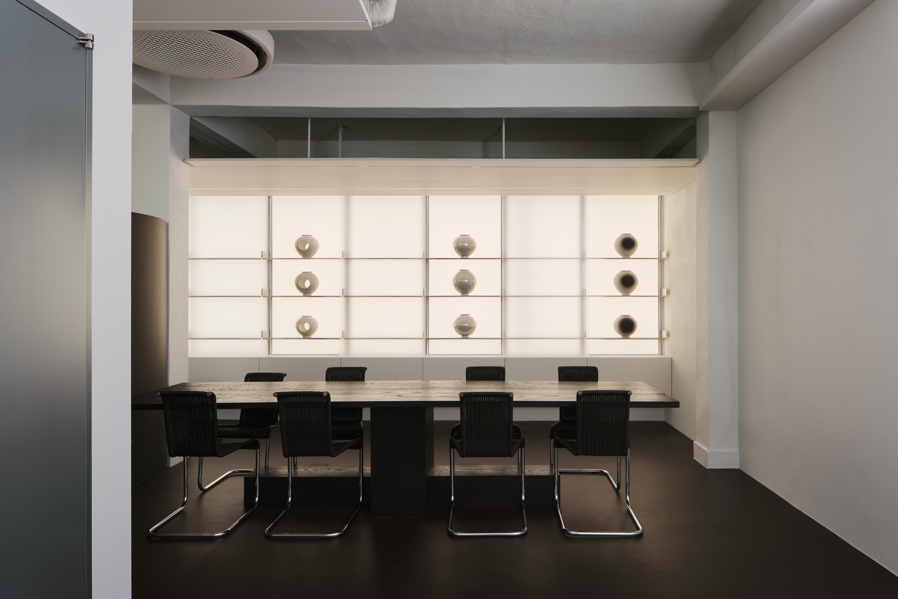
Elements 엘레먼츠 성수
당연한 것처럼 보이지만 누군가에게는 특별하게 느껴지는 형태가 있습니다. 내가 보기에는 평범하지만 다른 사람에게는 특별하게 느껴지는 형태들도 있습니다.
이전 프로젝트에서 빈티지 스피커의 매력에 빠진 클라이언트는 스피커를 위한 공간을 만들어달라고 했습니다. 공간에 채워질 음악을 들으며 공간에 필요한 가구들을 제작했습니다.
거대하고 광활하게 한쪽 벽면을 채우고 있는 직사각형의 스피커와 간결해서 불편해 보이지만 놀랍게도 편의적 기능을 갖춘 가구들, 청바지와 레진으로 만들어진 실험적인 스타일의 검정 바. 이들의 소재와 구성은 서로 느슨하면서도 그 어느때보다도 단단하게 엮여 있습니다.
There is a form that seems ordinary but special to someone. There are also forms that seem normal to me but unusual to others. In a previous project, a client who fell in love with vintage speakers asked for space for speakers.
We made furniture for the space while listening to the music to be filled in space. The vast, expansive rectangular speaker that fills the top of the entire wall on one side, furniture that looks simple and uncomfortable but surprisingly has convenient features, the experimental style black bar made of jeans and resin. Their materials and compositions are woven together loosely but firmly than ever.
Client: @elements_cafe_
Location: Sungsu, Seoul, Korea
Category: Interior Design
Typology: Food & Beverage, Space, Commercial

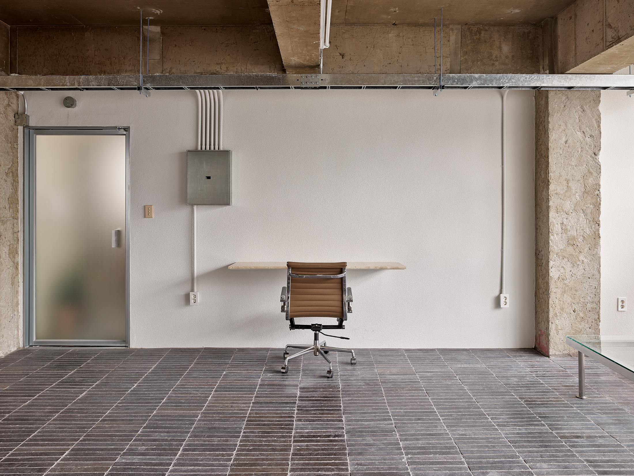
Neue Atmung 노이에아트멍
노이에 아트멍은 얕고 조용하며 잔잔하다. 그렇기 때문에 편안함과 경건함을 준다. 빛과의 조화 역시 자연 요소 중에 하나인데, 자연적인 빛을 이용해 어둠과 밝음을 극대화시키고 공간을 강조하였다. 작은 암석들과 나무, 오후의 빛에 반사되는 금색 빛 물결, 천정에 들어오는 햇빛의 표현들. 이렇듯 빛, 바람, 나무, 하늘 등 자연은 이 프로젝트와 긴밀하게 결합하고 있다. 간결하고 단순하지만 차갑지 않은 느낌을 받게 하고, 자연에 더 가까이 다가갈 수 있게 하였다.
Neue Atmung is shallow, quiet, and calm. So it gives comfort and sublimity Harmony with light is also one of the natural elements, we use natural light to maximize darkness and brightness and emphasize space.
Little rocks and trees, golden waves of light reflected in the afternoon light, expressions of sunlight entering the ceiling Nature, such as light, wind, trees, and sky, is closely combined with this project. We tried to make this place to be simple and concise but not cold, rather for people to get closer to nature.
Client: @neue_atmung
Location: Sinsa, Seoul, Korea
Category: Interior Design
Typology: Food & Beverage, Space, Commercial

일식 레스토랑 오묘의 브랜딩은 단어 자체가 자아내는 심미적인 분위기를 시각적으로 재현해 내는 것에 집중했다. 특정한 형태나 조형 디자인을 최대한 배제하고 사람들의 기억 속에 강한 잔상을 남길 수 있는 컬러 그라데이션을 사용해 오묘함을 극대화 하고자 했으며, 오묘가 추구하는 미묘한 맛의 디테일과 연결시켜 미각의 경험을 시각적으로 확장시키는 것이 중요한 과제였다.
Client: Individual
Location: Youido, Seoul, Korea
Category: Visual Identity
Typology: Japanese Dining, Branding
The branding of OMYO focused on visually recreating the aesthetic atmosphere that the word itself evokes. We tried to maximize the subtlety (OMYO) by restraining certain shapes or distinctive designs but using color gradations that can leave a strong afterimage in people's memories. It was an important task to visually expand the experience of taste by connecting this with the subtle taste details pursued by OMYO.
Client: Individual
Location: Youido, Seoul, Korea
Category: Visual Identity
Typology: Japanese Dining, Branding

Simjae 심재 삼성

Simjae 심재 삼성
Client: @simjae_official
Location: Samseong, Seoul, Korea
Category: Visual Identity
Typology: Food & Beverage, Poster Design
Location: Samseong, Seoul, Korea
Category: Visual Identity
Typology: Food & Beverage, Poster Design
420hz
Elements 엘레먼츠 분당
